Lighting
Before the end of the 18th week, I started to do another pass on my models. This being a light map pass. When I work, I mostly try to create models as quickly as possible, I want to make them and texture them and get them in UE4. Once they're in UE4 they will often be changed or edited, since it will be compared to the whole scene. Because of these later edits, I tend to leave light maps and collisions later down the line. However I've had feedback multiple times from my tutors and my peers to work on the lighting in my scene. However this project will be using baked lighting (static), which means I have to create lightmaps for anything that doesn't.
The above image is how the scene looks with just light maps. Everything that isn't green most likely doesn't have a lightmap. However some assets do have lightmaps, but I need to go into the settings of each object and manually change to location of the light map. This isn't really a difficult process, but the more assets there are the longer it takes.
There are a bunch of assets that do indeed have light maps, but due to editing the model, their UV's would have errors or unintended stretching. An example of this would be the walls.
In the above image you can see that the majority of the models are green. To only assets that are red or blue, are assets that are still unfinished. A quick tip that I want to give is that if you've made new light maps for an asset and after re-importing them there isn't a change, then its most likely using the texture channel instead of the light map channel.
This could be because of multiple reasons, either you had Unreal automatically generate light maps at the start, or the model didn't have a second UV channel when it was originally imported to Unreal. The fix is to simple change the destination of the light map in the static mesh's settings.
Now that I have all the light maps in place, I can properly start a lighting pass. The above image is what the scene looked like before. Everything is pretty flat and dull, there isn't much interest or guiding with the lights. And the models don't really look like they belong with eachother.
And here we have my first pass at lighting. As you can see the models look more at home, and realistic. I think most of my materials look great, but weren't able to show off their full look until now.
And now here's how the scene looks from two different positions. One is in the hallway just before the large room, and the other is looking towards the back wall with the tree.
Now I want to go over some of the lighting I've put in the scene. Currently there is a skylight using a HDRI that is royalty free from HDRI Haven. The specific HDRI I've used can be found here.
The intensity of the sky light light is currently 8cd/m2, I do have increased the bounce lighting as much as I possibly can. So that it can fill in the room.
Then there is a directional light that is around 10 lux units.At the moment, I'm trying to light an overcast day. This is due to the concept having to what appears to be rain drops coming into the house. This says to me that it is cloudy, because there is rain.
Additionally I have spotlights and rectangular lights to support the lighting.
There is a directional light pointed at the window in front of the entryway of the large room. Here I'm trying to replicate the slice of light coming into the room as seen in the concept. This isn't necessarily realistic as it would have to be dawn or dusk for that slice of light to come through. It could be possible with just a strong bouncing sun light, but then why does this not appear in front of every window in the concept?
The rectangular lights are positioned just in the centre of each window, to give a sense of more light coming from the windows.
At this point in time, I felt like it was a good idea to try and get some feedback from my peers. The lighting is already a huge improvement from what it was last time, however it can be pushed further. And hearing critique from other's can help me decide in what direction or how to use my lighting.
After getting feedback, the general consensus from my peers and myself was that the corners of the room was too dark. This can be fixed with putting more point lights that don't cast shadows, to just up the brightness. This also brings a warmth to the corner.
Another piece of feedback was making the slice of light much stronger. Which I did by both making the directional light outside stronger and closer towards the window. Something that I will test out later is placing foliage in front of the lights to try and get some irregular shadow, which could give a sense of vegetation surrounding the house.
With the objects surrounding the slice of light on the ground, I wanted them to be much brighter, similar to the concept. A suggestion from one of my peers, recommended placing a rectangular light on the ground to essentially fake the bounce light. I tried this out and it worked really well! What I think makes it work, is making sure that the rectangular light is of the same dimensions as the slice.
Above is what it looks like before adding the rectangular light.
Below is what it looks like with the added light from the rectangular light.
As you can see, this gives a large difference. Before its much more difficult to see details. But afterwards everything is illuminated, and it doesn't look too out of place.
Going back to the corridor, I wanted to add a few more lights at the end of the corridor, and one rectangular light in the door.
The rectangular light is meant to suggest the light coming in from the outside through the gaps of the door. Its also cold, so as to not appear interesting. Further down the corridor is some stronger lights with a warm colour, this is to direct the player to walk down the corridor.
Once the player walks down the corridor, they will notice a strong directional light pointing and going into the next room. This is supposed to lead the character into entering the large room.
As the player turns to the room they will then be invited with a white birch tree contrasting with all the warm colours of the wood.
And then it opens up into the whole room, which allows them to explore the contents inside.
So far I'm quite happy with my lighting, and I think future passes will mainly be small tweaks such as adding more fill lights to bring attention to certain subjects or fill in darkness.
Ivy
In this week I was finally able to get my Ivy texture completed and brought into 3ds max. As with all the foliage the first step is to cut out from the texture. With my leaves I want a bit more geometry, so that I'm able to bend and warp them into a shape similar to real ivy. Which is the next step.
I want some of my ivy, to be climbing through a broken window and sticking to the wall. This is supposed to suggest that a long time has passed since anyone has cared for this old derelict cabin.
Below area some of the references I have that influenced my decision.
To create this I would need to create a spline. Making sure that it fits around the geometry of the window and wall. Because this is supposed to be uniquely fitted to another object, that means the object its clinging to shouldn't make any drastic changes. Cause this will mean re-creating these vines of ivy.
After the spline is in position, the leaves can now be placed along the spline. Using an animation control in 3ds max makes this process much easier, as it constrains the path of the leaf to the spline whilst still allowing you to rotate and scale the leaf.
This option can be found just like shown below.
Here is what it looks after placing all the leaves along the spline. It's important that you get full use out of this and have as much variety possible, as this can become pretty high in tri count quite quickly. The purpose of these vines of ivy, is to wrap around the geo and make the environment look more alive.
This could be done with blueprints, however with limited time I'm not able to learn and test out how to create this in blueprints.
Here is how it looks in Unreal, it might be difficult to see the stem due to the colour drowning in the wood. But it does help give the idea that nature is trying to invade this space.
Here is what the ivy looks like close up. I wanted it to be fairly detailed to try and push for a realism similar to that in Metro Exodus.
Map
One asset that I was unable to make in the previous week a long with the Radio, is a map. This map is important as it tells the player where they are, what their current situation is like, and what the character is planning to do.

The map in my environment serves a similar purpose to a map within a game. However by adding narrative elements similar to Left 4 Dead, I can help give a push to understand the narrative.
Here are my references. The image on the left is what I want to base the folds of the map off of. Since the map takes up a large area on the table, it would make sense that the player character would fold it when traveling. Then the image on the top right is the map the player uses in Metro Exodus. As you can see everything looks as if it belongs in the world, and all the objectives look as if they are handwritten.
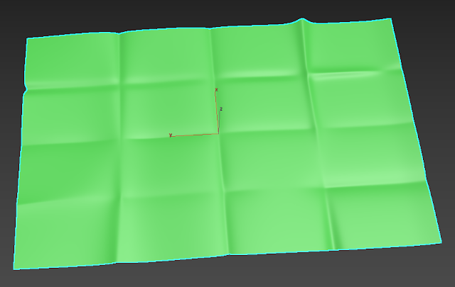
First thing I do is create a simple high poly model in 3ds max. This is meant to focus on just the main folds. The process was pretty simple, just moving vert's around until they look like this.
Then its taken into ZBrush to add just an extra level of folds and crumple. A useful brush that helps is the Crumple Brush. It sharpens some of the edges whilst also pushing them to be uneven. I also went over some of the folds I created in 3dsmax with a dam standard brush.
Then a low poly version is made. I didn't want this model to be a simple plane, as there would be artifacts if I did that. I made sure to only add enough geometry to allow for a good bake.
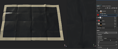
Here is what it looks after baking. Looks like the bake had good results. At this point I was trying to decide how would I make the the terrain and illustrations. At first I thought that I should try making them in Photoshop, using images from google maps of a real Russian location. Then I thought that I could possibly make the illustrations in painter using the mask outline filter. However this would mean that I would create some really complex smart materials.
Which is fine, but the issue with both of these methods is that I would have to hand draw them, which can take a lot of time. So for now I put it at the back of my mind and just worked on texturing the map.
I created a second layer duplicating the first, and made the colour slightly darker. I used a grunge map to distribute this unevenly across the map.
After that I create a layer that essentially a layer of paper underneath the plastic coating of the map. This was a piece of advice that I got from one of my peers. Doing this helps make this asset believable.
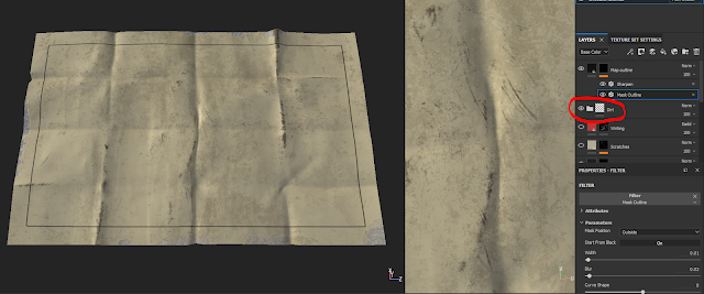
Here I added dirt and some edge damage to the map. There is more likely to be damage to the map at the edges of the folds than anywhere else. Because depending on how the map is folded, these edges will be facing outwards, which opens it up to being damaged or dirtied by the elements.
At this point, I have figured out how I could add the illustrative elements to my map. If I don't want to hand draw the map with a smart material in Painter, whats the next best thing? Substance Designer. Using Designer I can generate the terrain I want, and use some useful nodes that can lead to good results.
I used the clouds 2 node and ran it through a quantize node. This basically limits the amount of greyscale values that appear, going from either two values (black and white) or more. What I wanted to create is something similar to the mountains shown in the image below.

There are lines detailing the outline of the mountain, whilst also showing where the mountain elevates or where the peak is. If I did this by hand, I would have to draw every single line and make it slightly different each time.
Using the quanitze node, allows me to choose how many lines there will be going down the mountains. Running that through an edge detect will then give the map that I wanted. Then using a histogram scan node allows me to pick everything but the darkest values. The darkest values would be lakes, rivers or ocean as its below sea level. Then anything that is grey will most likely be ground, and anything lighter will be elevation aka mountains/hills.
The three maps that I exported was the quantize map, the edge detected version of that and finally a simple grid. The greyscale map works well, since using a levels filter in the layer allows me to pick and choose where the colour will be applied. Which is demonstrated in the image below. W= Water. G=Ground. M=Mountain.
This stage is typography, adding writing to the map. I wanted to name the location Mokrov, but running that through Russian letters it comes out as "мокров". This isn't really meant to make much sense as its just a town name.
On the bottom right corner there is "пейзаж" this means landscape. That this map is just meant to be a representation of just the landscape and not a map of roads or buildings.
Then across the left and bottom of the illustration are numbers and then the russian alphabet. This is meant to give a sense of order, and that each square is properly labelled. I know that with most maps, my version doesn't really make too much sense. But you get the idea.
And then the last piece to this texture is my own handwriting/drawing. I drew where the location of the building the player is in currently. The location of enemies that surround and patrol a mountain, meaning that they have a camp in that area. And then finally is a star for a safe zone, a town or refugee camp, a location that the player is heading to for safety.
The two arrows are meant to show how the player is planning to move, but it's difficult since the raiders are blocking the only land path to the safe zone. The arrows are also meant to show the player that player character is trying to go somewhere, and that there is a reason why they might be hiding/staying in a derelict cabin.
With the writing, I went through a few different colour variations. As I wasn't sure what looks good and easy to read. I asked for some feedback from some friends. I found out that blue is the easiest to read, but doesn't look great. Red and Black looked much better aesthetically, but could still be difficult to read.
So I opted for a colour in between black and red, and set the blend mode of the layer to AddSub. Which help made the marks look as if it were done with a pen/marker.
There are a few things that I missed out such as roughness and colour variation. But I feel that this is probably enough to understand my process in texturing. And how I used both Substance Designer and Painter to get a more believable asset.
Finally here is how it looks in Unreal Engine.
To end off this blog I wanted to share a little thing I created expressing how I feel about my lighting. And also as a little thank you for anyone reading this.


No comments:
Post a Comment