Whilst I really like the concept I can't follow it 100% as I need to fill up the scene with objects that I have a good understanding and great references of. I can follower the colour scheme and composition but somethings will naturally rear away as I sometimes can't find real life references of the objects in the scene.
I will go into the process of the environment as a whole at a later date as this blog post focuses on just the diorama.
As the sunflowers are one of the hero assets of the scene I thought that this would be a good place to start if any. I collected and gather as many refences I could. Getting images of the sunflowers that are older and withering and others that are still fresh and green. Seperating the different elements of the sunflower, what the petals look like, how the disc floret is structured, and all the variations of how the leaves can appear as.
These were useful to understand how the back of a sunflower looks and is layered.
This was useful in creating the overall composition of the sunflowers in the pot, and also a reference for creating the pot that houses the sunflowers.
The two images that I have pointed to were useful in understanding how the flowers in the centre of the sunflower looks before and after blooming.
Creating the Sunflower
I first started by sculpting the base of the sunflower, which was a fairly simple shape. After that I then created a small little leaf and moved and shaped some of the duplicates to create a variation of leaves. I then placed them accordingly to my references and dynameshed them all together with the base, smoothing out any issues. Before merging I had added more geometry to the bases of the leaves so that after merging I can smooth them out and make them look as if they were growing out.
Then came the repetitive task of placing lots and lots of popcorn.
I created a simple sphere and then used a dam standard brush the carve out 5 lines. I then started to duplicate and place them accordingly, I started from the centre and worked my way outwards to the edge that I made.
This image gives me a similar feeling to tropophobia.
After placing all the popcorn, I created a simple shape that resembles a blade of grass. Looking at the reference, the blades are actually serrated but I felt like it was such a small detail that it would likely be lost in the future bake. So I saved myself a little bit of extra time and used this simple shape.
Here's how it looks after placing the blades, the formation gets much longer towards the centre and barely noticeable at the edges.
Here's what it looks like without the popcorn.
I then created the other elements of the sunflower which are pretty straightforward in comparison. I thought that separating all the elements and compiling them together in the low poly would be best as it could become complicated if it was all just one high poly mesh. And I still wanted to keep things reasonable to a game production standard.
Creating the low poly versions were pretty simple. Planes for the petals and leaf, whilst I retopped in 3dsmax on top of the highpoly stem. I found that I was pretty difficult retop in areas that were really tight and I was left with a few holes here and there. I thought it might not be an issue since the textures will be double sided anyway. The overall shape was fine and couldn't be noticed until looking closely.
After creating the low-poly I did a test bake to see how it would look and the results were surprisingly good. I had to separate the meshes into two different painter files as the parameters for the cage had to be different.
After all the texturing I composed the low-poly in the same way as the main reference I was following and it looked good. But there was an issue that I realised. The low poly was too dense. Each sunflower was roughly 15k tri's. And adding five of them together brought that up to a whopping 75k tris'. This was too excessive and I needed to optimise this.
I studied my model closely and figured out all the parts that were excessive. What was taking up the largest amount of those tri's were small flowers surrounding the centre, and the stem of the plant.
I made a sketch in photoshop and figured out how I could optimise this model better.
I did a rough sketch of what my model currently looks like and what it could be. Instead of a re-topped high poly it could be a much more simple flat clone built in layers. Additionally I could remove topology from the small flowers and have them resemble planes. I added extra geometry to cut away unneeded alpha space, but what I needed to lower the density instead.
Something that I thought of was:
Should I have a dense mesh without wasteful alpha space that complicates the shading?
Or should I have a model that isn't excessively dense and let the alpha cards do what they do, which is being an alpha?
I decided to go with the latter.
With the changes I was able to get the meshes down to a more reasonable 4k tri's, making the whole collection of sunflowers roughly 20k tri's.
Here's a comparison of the old stem compared to the new stem. As you can see I made it so that there is a separate cone of leaves that can be placed in front of the stem to create the variation and to fill up the amount needed.
And then here's the flowers next to each other. The old on the left and new on the right.
If I were to optimise this model further I might have created a ring of flowers in substance designer instead of placing individual flowers. The only drawback with this would be that the sunflowers would appear more flat, and would need either tessellation or have some alpha cards placed to add more dimensionality. But I felt like I optimised this model enough and wanted to move on.
Drawers Trim-sheet
When I started to create the nightstand that the sunflower pot sits atop on, I thought about the amazing material work from
Keegan Keene. Whom created a furniture trim-sheet of a kitchen cabinets and drawer desks. I felt inspired and wanted to level up my own trim sheet work and thought that this was a good opportunity.
I didn't want to copy Keegan Keene so I gathered my own references and based my material of of those. I looked into a lot of vintage kitchen cabinets and drawers, I wanted to create a trimsheet that can be used multiple times in the final environment so I wanted it to be robust enough to support that. I also had to keep in mind what the drawer/nightstand looks like in the original painter studio concept.
I looked into different repeating features that are commonly used in vintage wood work. And fount some interesting patterns.
I even found a variation of vintage handles and key holes, and different structures of door handles and the old metal would look like. I especially like the honey comb handle.
I even took my own photographs of the door hinges in my house.
Modelling
I started off by measuring the different sections of a 2 meter square plane, dividing it into the sections that would be the drawers, the doors and all the metal pieces.
All the wood sections of the material was created fairly quickly as the shapes were pretty simple. I had to keep in mind how certain parts tile and added tweaks accordingly. The composition is similar to Keegan Keene's material but the contents is different and better suited my needs.
Parts of the metal pieces are fairly complicated such as the handle and the curvy hexagon shape. On some of the models I extended a base out so that there will be a better bake result, this required to paint the vertex normals for the complicated shapes so that the different elements can be easily selected and masked in substance painter.
I also made sure that the smaller details of this material could properly tile as well if necessary, and I have to make sure that it still does in the texturing stage.
There were a few issues that happened in the first bake, mainly that the tiling parts of the material had a problem with the AO not making it tile properly. To fix this issue I extended the tiling meshes to outside of the plane
However there was still an issue with the Thickness map from the bake, it should be consistent across the whole texture to the edge. I'm not sure as to why this is happening. Perhaps painter doesn't like baking tiling textures, or there might be some settings in the bake that fixes this issue.
Here's the ambient occlusion to compare, as you can see there are no artifacts on the edges.
Any of the issues I found weren't a real problem as I could fix them manually in either Substance Painter or in Photoshop or Substance Designer afterwards.
The final result turned our pretty good. The great thing about Unreal Engine is that I can alter the colours post production to add more variation without having to revisit the textures.
After constructing the Drawers I simulated cloth draping atop the surface, creating some nice tension folds to make the edges of the cloth wavy similar to the original concept.
I re-topped over the high-poly creating a low poly mesh and textured it in Substance Painter. And attached it to the Drawers with a different Material ID. I brought everything into Unreal Engine to get a quick lighting set up and see what it looks like.
At this point I wasn't sure as to whether to stop or continue pushing it, I talked to some of my friends and asked for critique so I can get a better idea of where I should take this. I felt like this is too little to be what looks like two assets. I also felt that it was too vertical and that if I wanted to expand this that I should try expanding the scene out horizontally.
A good way to expand the composition is putting the assets onto a floor instead of just floating, and including a few more assets to give context as to what might be surrounding this sunflower.
I looked at the original concept and tried to expand what was their with my own sketches. Its a pretty rough sketch but it conveys what I thought the rest of the chair may look like.
I tried searching for a chair that looked as similar to this.
This was the closest chair that I found. But I didn't really like how it looked. I did like everything about the chair besides the back support. This type of chair is called a bentwood chair, there are lots of variations of design, however I found a specific design that I liked as I found it to be more elegant. A bistro bentwood chair.
I especially liked the engraving on the seat of the chair.
Since I found what I wanted I got to modelling the chair. It was pretty quick and simple, I used splines to create the back supports and the legs of the chair. It took some time trying to get the correct proportions but I think it was made easier with the help of a special scientist.
I took the model into Substance Painter for texturing. The wood grain is made up of multiple layers of directional noises
To hide any of the seams I manually painted atop of the model to make sure that it all blends together. For the engraving on the seat, I traced the reference in Photoshop. I had to warp the image to be more flat and orthographic, and paid close attention to the parts that were faded to get an accurate re-creation.
I then immediately took the chair into Marvelous Designer so that I could simulate and create the pillow that rests atop of the seat. As I'm still fairly new to Marvelous I followed a few tutorials on YouTube on how to create a nice puffy pillow.
Before I could re-top and texture the pillow, I had to fix some issues of the high-poly in photoshop. One of those issues was the piping at the edges of the pillow not properly merging with the base of the pillow. I also did a quick clean up of the surface as well giving a smoother finish.
For texturing the pillow I followed what was in the original concept but with a twist. The pattern mainly follows the concept however the overall texturing and detailing followed a real life reference that I have in my own home. As I could touch, move and closely look at the details of the real life pillows, I didn't need to have any photographical references.
Here's a photo of my pillow.
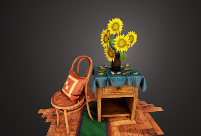
And here's what the scene looks like at this point in time.
I like where this is headed but I felt like this was a good time to ask for more critique and revaluate what is currently there. A friend of mine Litha Bacchi brought up some good points of critique such as adding more cool colours to break up all the warm, to add a rug to break up the constant wood and to push the sunflower petals more. We both agreed that the sunflower looked pretty artificial and stiff, and getting another viewpoint that sees the same issues enforced the idea of fixing them.
My Dad also brought up a great point about the wood floor, about how the wood grain shouldn't be going diagonally across the planks. This was an easy fix that just required more nodes to limit and push the grain in the direction of the planks. The issue was caused by directionally warping the wood grain texture onto the plank pattern. Something that was just part of my oversight.
Going back to the sunflower. I created a few more variations of the petals, bending them in ways I hadn't before. And making a few that closer resembled the photo reference I was looking at.
I then separated out all the petals from the model into a new mesh, so that I can add in the new petals and change the composition of the original petals. I also added a noise modifier on multiple groups of petals with different intensity's to add more randomness similar to the reference. I also selected a few of them to be a new Material ID so that I can tweak the colours in Unreal Engine and have a slightly different variation.
I did the same tweaks to the leaves and petals that fell onto the surface below. Desaturating them and pushing them to a more brown value.
Here's what it looks like now in Unreal Engine.
Another thing that I tweaked was the leaves. Litha pointed out that the veins were too large and obvious. I also knew that I needed to tweak the colours as well so that it has a better transition from stem to leaf as at the moment its quite dramatic.
I went back into ZBrush and used the pinch brush to make squeeze them smaller. I also fixed and tweaked the colours as well to better reflect the colours of the stem.
The last few additions was tweaking the colour of the orange cloth to be blue instead, which can easily be changed with parameters I set up in the material within the Engine. And the rug that drapes off the side of the floor. This was made pretty easily in Marvelous Designer, and I took both the blue cloth and the rug into ZBrush to add in more micro details and extra folds. I made sure that there weren't many micro details on the rug, as the stiffness of the fabric wouldn't allow them to form.
Below is the main reference I used for texturing the rug.
I looked at still life photography to find a reference for the micro details for the cloth sculpt.
I did try out a different colour combination for the rug as well. I originally had green as the main colour and blue and red being the trim colours. I thought that I wanted to repeat some of the colours of the scene such as the green from the stems and leaves of the sunflower. I wanted a cool colour to break up the browns, but I wasn't sure if it should be green.
I tried out purple instead as I didn't want the colour to be close to blue as I already have the blue cloth. So I thought a cool purple might be interesting. But after comparing the two colours, my original choice of green seemed to be the correct one. I could possible tone down the vibrancy of the purple but I had already chose the green colour as it made sense with the overall colour scheme of the scene. And if I made the purple into a warmer colour then it defeats the purpose of having the rug.
Green, orange and blue are the most dominant colours. Adding another strong would throw off the balance.
Finishing Touches
At this point I felt like I have come to the end of this asset showcase diorama. I was tweaking the lighting a bit trying to get it finalised. But I had the thought of trying to get the scene to look just as good as renders in Marmoset to be the same in Unreal Engine.
And to do that I used the Post Process Volume I made some small changes to the values in the settings like Ambient Occlusion and exposure. But the two biggest changes were the LUT and the Sharpen material I created.
You can probably see that there isn't that much of a difference from just the LUT tables.
But what it does is up the contrast and vibrancy of the scene.
Above is before without the LUT.
Above is after with the LUT at full. As you can probably notice the effect is a bit too much and washes out some of the details on the petals. I changed the intensity of the LUT value to be 0.4 instead of the full amount. So I get the effect I want without ruining my details.
The next affect is the sharpening. Its a pretty basic material.
Above is before the Sharpening.
Above is after the sharpening.
The difference is clearly visible. But what this does is wonderful. One of the issues that I have found with the cameras in Unreal Engine, is that they always seem to have a slight blurry picture. Not being able to capture all the details I wanted. I'm honestly surprised as to why this isn't built in into the default settings.
Going back to the scene, I found that the sharpen can be pretty jarring from further distances so I made the intensity of the value to be 0.5 instead of the full intensity.
The setup is pretty simple, their are quite a few videos on YouTube that talk about this and walks through the process of creating it.
Before I could finally call a wrap on this diorama I wanted to get one last critique on the scene as I wasn't too sure about the background being just a pure black, as it is quite a contrast between the scenery and the background. I asked another friend of mine Lily Dunn her opinions on it. And she suggested adding a gradient instead.
We both drew up our own versions on what it would look like on one of the pictures. And this is what it looked like.
The gradient was still a bit too dark, however it was a good direction. I created this in photoshop pretty quickly, but I didn't want to edit all of my images in photoshop masking each image and adding the gradient one by one. And it would also complicate things in the turntable video, I can't edit every frame in photoshop.
Instead it would be better to add this in the scene. Originally I thought of adding a huge plane behind the scene with a gradient texture. But this was pretty short sighted as there were issues with perspective, if I looked too much to the left or right, the gradient would disappear. Instead it had to surround the scene.
I created a box and used the spherify modifier in 3dsmax. Since boxes are already unwrapped perfectly before by 3dsmax I didn't need to unwrap the sphere. I also added a turbosmooth modifier to add an extra amount of polygons to smooth it out.
I created a very simple emissive material with the fresnel function. Since this doesn't need to be rendered at all, there was no need for it to be baked into the lighting.
An interesting affect that I didn't think about and stumbled on accidently was that the lightest part of the gradient will always be in the centre of the sphere. Which means I can put the focus onto the sunflower having it be the brightest part to draw your eye to it. Creating a better composition.
I think that just about covers the main points of this diorama. As this is already quite a large post I think it would be good to end it here. Please look forward for when the whole environment is finished. And a big thank you to everyone that helped me with their critiques and opinions.
To follow the progress please visit any of the platforms I'm on.


No comments:
Post a Comment