Week 1
Hello! This is a new project that I'm excited to start working on. I technically have a longer time period to work on this compared to the previous project. I have 3 academic weeks plus an enhancement week, which isn't really accounted for. So all together I have roughly 4 weeks for this project. I have the same restrictions that I had last time, 2x2048 texture sheets and a 50k tri budget and a texel density of 1024 per meter squared.
This project I'm going to do things a bit differently, first of all I'm going to be more free with the materials and textures, since I had so many more textures to spare by the end of the last project. I'm also going to be a lot more consistent with the composition and the story in the scene from the beginning.
The project that I chose to do is the Behind the Door brief, my reasoning is that the brief is quite open ended with the theme, all I need to follow is that the door is circular and that the environment fits with the style of the door. The project aims are:
-Work to an authentic, realistic style.
-Collected,collated,analysed and annotated photographic reference for usage.
-Created and use tile-able textures.
-Demonstrated efficient modeling.
-Demonstrated efficient texture usage.
-Create convincing surface properties using PBR materials.
-Stretch goal: Create dynamic elements.

This is very rough sketch of my idea, but I was able to get down on paper what I want to achieve. I wanted a snow environment, and a oppressive mood. The scene should feel hostile and bleak. To do this I wanted a somewhat dark environment where there is a warm light source that contrasts with the cold surrounding.
The composition is solely around the door, I want the surrounding building to bring the eye towards the door. With values I want to have dark concrete walls to contrast with a lighter colour metal door. There should also be a contrast of roughness between the door and walls.
The story that I want to portray, is that someone was being pursued by a beast or monster. This person hurriedly tried to enter the secure building, however they were too slow. All that remains are bloody hand prints on the doors monitor/keypad, and the trail of a bloody body being dragged away. This story would add an extra layer to the hostile and bleak feelings I want to portray.
References

I was originally started looking into arctic environments and scientific bases. The first place I could think of was the Svalbard Seed Vault. Something that I really liked about this building is that it was an entrance into a mountain, I like the idea of only being able to see a small part of the whole structure. And if the entrance is large then it gives the idea of scale. I also looked into Martian bases as well, since it would also be technically a hostile environment. But the idea of snow just overpowered the martian idea, so i put it aside.
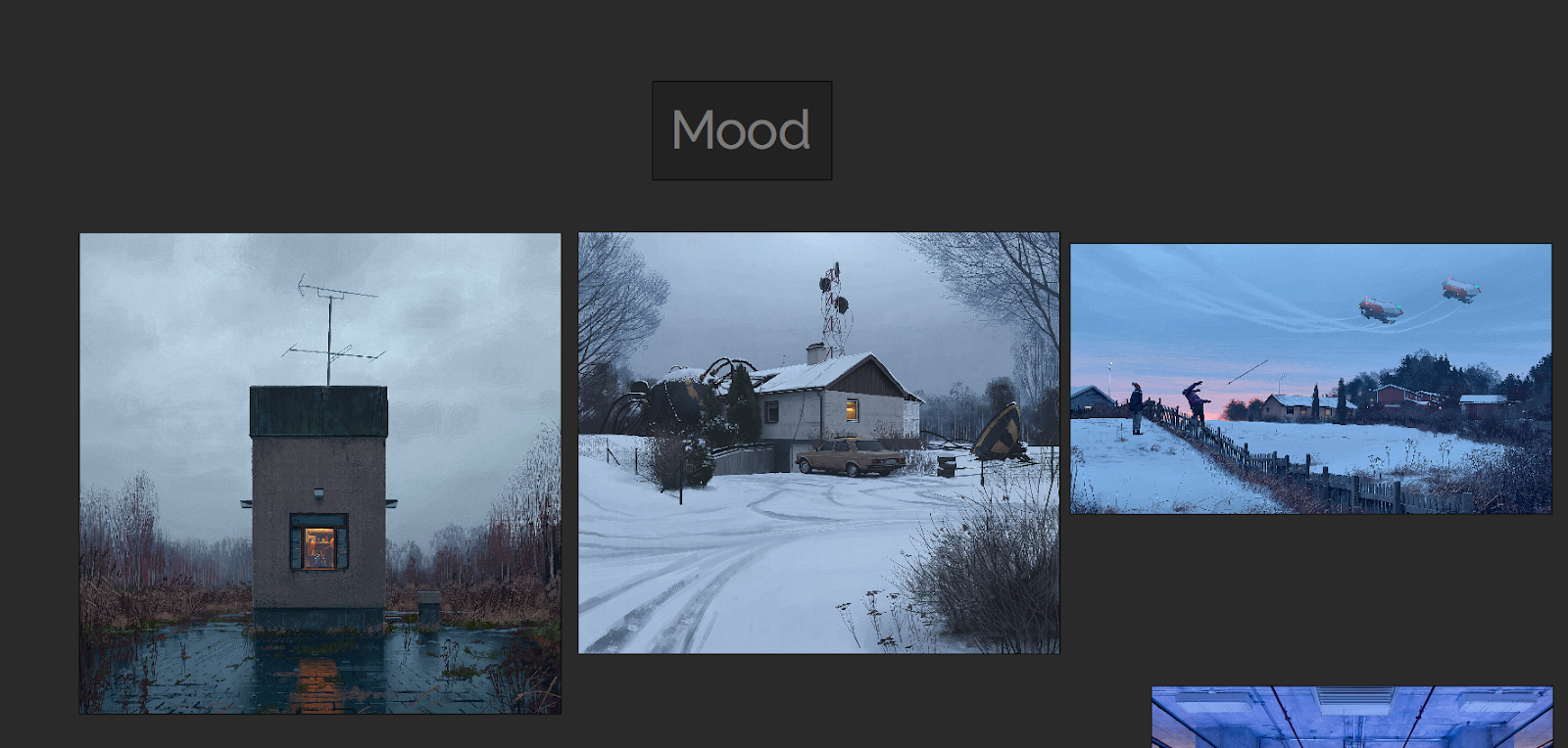
I looked into the work of Simon Stålenhag for inspiration on colours and values. I knew that he has done multiple paintings of cold/snow environments. You can see that in each painting he has pulled in focus to subjects with using a saturated bright warm colour to contrast with the surrounding cold colours. Also in the middle painting you can see how he controls the eye by using the lines of the trail made by the car; to pull the eye in from the bottom left corner. I could also use this in my own environment with the blood trail.

For my environment I'm wanting to combine near sci-fi with Brutalism. I feel like the contrast of metal and concrete can work really well together and give a domineering effect. Especially Brutalism can work really well, having a contrast of large simple geometric shapes with the complex and detailed metal work. One movie that I can think of that combines this well is Blade Runner.
Production

The first thing I immediately did was create a block-out and put it into Unreal. The sooner I can get into Unreal, the better. My reason is that I can define shapes and mood early on with simple geometry and lighting. I can also start to set up camera's and draw over the screenshot to brainstorm.

I came to this idea that I needed to lead the player to multiple points of interest that would house the story. The major point of interest would be the door, then the secondary would be a generator or some field equipment that's been destroyed, and lastly the dragged body trail that links the first two points of interest and creates a third that goes way off into the distance. How I would point the player to these locations is by using lights, some of which would be fallen over and pointing to where ever I want the player to go.
My idea of the environment would be shrouded in thick fog of a snow storm, that heightens the mood, but also means light can be used direct the player. My inspiration from this comes from The Last of Us, where a section of the game you are lead through a snow storm and follow a bunch of burning barrels as your guidance.


After thinking for a while I decided not to spread by points of interest all over the map, and instead hone in onto one key area, which is the door. The advice I got from my last project was to keep it small, and by moving the lights and generator closer to the door, I can keep the environment contained. This may change later on however.
Also instead of working on my models and textures I thought it would be best to focus on the snow storm beforehand. Even if I had the best models and textures, if its in a crap fog then it will all look crap.
Since I had no idea how to create a snowstorm, I looked into the Learn section of the Unreal Engine Launcher (Epic Games Launcher), I remembered that I saw a demo at GDC that showed off particle effects. And that it had some really convincing snow. I downloaded the level and started looking at how they created their particle systems.
One of the major parts of the blizzard particle effect was this animated fog, I looked into how they did this and saw that it was a cloud texture that is in a grid of 8x8 clouds. And that the texture was used in tandem with a ParticleSubUV module within the particle system. This creates an animated particle effect.
Since I knew what I had to create, I then needed to figure out how I could create this texture. After some researching I found that Houdini could do what I wanted. However I felt quite overwhelmed, because I had never used Houdini before. I knew that I would use Houdini at somepoint, but I guess the earlier the better.

My first attempt at creating the texture is what you could see above, but there were multiple problems with it. First of all the edges of the fog were too crisp, you can clearly see where one particle ends and the next begins. Second of all the animation started off with the fog being small and then getting bigger. The problem is with this, is that you can clearly see where the particle effect spawns and then dies.
What caused these issues, is that the simulation I did within Houdini was an Explosion and not a Billowy Smoke. With an Explosion the is an expansion of gas from an epicenter. What I wanted was a fairly consistent sized shape that would slightly change. And to get that I had to simulate a Billowy Smoke instead.

Here the simulation is attached to a sphere, and the smokes girth inherits the girth of the sphere. This means the shape size stays fairly consistent.
Seeing the actual textures will probably be more understandable.
As you can see there is improvements I have made from the first test to the second. The shapes are a lot less defined, like fog would be, and there is a consistent size.

To create this I first made a sphere and whilst it was selected, I pressed onto the Billowy Smoke in the Pyro FX.

Afterwards I changed some of the parameters within the pyrosolver (this controls the simulation) to get the results I wanted. Cooling rate affects how large the smoke will be. The viscosity affects how tight the smoke stays together and how slow the smoke travels. And buoyancy lift controls how fast the smoke moves upwards.

After getting the simulation that I want I created my own file cache to store the simulation, and limited it to 64 frames as 8x8 images adds up to 64 frames. This then saves and bakes the simulation, so that you can scrim through the animation without making the computer simulate again.


I then set up an orthographic camera and positioned it above the smoke looking down. This allows me to get a view of the smoke where it's size stays fairly consistent, and for the animated particle I wanted a somewhat circular mass where the edges dissipates randomly.
After rendering the simulation I could then go within compositing the image.

You'll also want to change from the Scene View to the Composite View so that you can actually see what you're compositing.

To get the grid image I used a mosaic node, this orders the frames of the simulation into a grid of whatever you set it to. However since we're going to use this UE4 it has to be in line with the power of two. This mosaic node also puts all of the frames onto the first frame, so make sure you view that single frame.
I then used a pre-multiply node which essentially softens the edges of the smoke.
And then its plugged into an output node, which then takes us to the output section of Houdini.

Using a mantra node allows you to render and export out images. However you only want to render out the current frame you are viewing, so change the Valid Frame Range, to Render Current Frame.
Lastly all you need to do is when you're rendering out the image to a location make sure that you end the name of the file with .tga. You need to manually write what file it will be exported as.

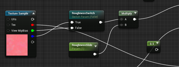
After all this, I then had to set up the Material in Unreal Engine.
A lot of this is me reverse engineering what I could find, and I slowly understood what the nodes functions were.

There are two extra textures that supports and adds to the 8x8 SubUV I created. I'll go over how I made those later. I'll first explain what I'm doing in this material.
Firstly I'm tiling the support textures to match the SubUV, so that they effect the individual clouds of smoke rather than all of them at once.
Next I'm using a Depth Fade to affect the opacity of the edges so that the clouds fade between each other, effectively giving a softer edge where the clouds intersect with each other or other objects.
SphereMask makes it so that you can see through the material at a certain distance, I'm coupling it with the PixelDepth node which outputs the distance the distance from the camera to the pixel being rendered. So it basically allows you to see clearly in a certain distance, and makes anything far away from the player opaque.
I also plugged scalar parameters into each part of the graph that allows for multiple instances of this material to be used in different scenarios.
I also want to make it clear that I'm learning this through reverse engineering the Particle Effects Demo, in the Unreal Learning tab. I didn't know how to do any of this, but by looking at what they did, I can figure out how to make something similar, and change it for my own purposes. This is pretty much the same as following a tutorial, but with this I'm figuring out the steps on my own.
Next is the supporting textures. The original particle system I'm referring to uses a bunch of textures within UE4's starter content, however I have to make everything myself. So I used those textures as reference and made my own in Substance Designer.

This is a cloud like texture that has multiple layers of detail. My approach was creating the background, midground and foreground. The background is framed "micro" on the graph. Its essentially a darker and more noisy cloud. The midground is the mid value between dark and light, and is not as noisy and larger. And finally the foreground are the largest and brightest shapes.
When creating textures I try to think within layers, and then combining those layers to get the full image. This allows to me create a depth to the texture.

This is a general noise texture, its structured by using cells01 as a sort of mask to define the limits of the rough shapes. Then I use the clouds texture to add variation and noise within those shapes. Its a similar sort of method to the previous, having a higher frequency of noise in darker areas, and having the lighter area's having a lower frequency and larger shapes in general.
This last texture is going to be used in the snow material, its made up of simple spheres and packed into an RGBA texture.


This is the material set up for the snow flakes that fall from the sky. A lot of the set up is similar to the previous material. Although one important part is the SphereMask hooked up to a PixelDepth node to make the material brighter, the further away the camera is.
Here is two pictures showing this effect.


Now I'll finally show the result of all this set up. There are two particle systems working together. First is the fog which has a horizontal movement towards the base, it's layered up with snow flakes moving in the same direction and with speed. This is to simulate a snow storm, in that the snow flakes would be pushed and accelerated by the wind.
The second particle system basically emits snow flakes dropping vertically with a slight horizontal push. Having the effects layer up together works well to get a whole feeling.


There are a few critiques I have for myself. Firstly there could be a third layer to this effect. Volumetric Fog. This would add much more ambiance to the scene as there would be some pseudo fog rays being created by the light on top of the door. Secondly the snow particles are moving in a predictable pattern, to give another layer of realism I could create my own vector fields to add randomness to their movement.
Although I understand how I could improve these particle effects, I've been working on them for almost a week, and I'm wanting to work on other areas of the environment. I'm pretty happy with what I have been able to accomplish so far, so I'll leave these improvements to be worked on later.

The next thing I worked on was tile-able materials. There is a lot of snow in this environment, so it only makes logical sense to move on to this next. I created a few variations of snow all at 1024 resolution, so that I could vertex blend between them.
I also set up the material to project itself base on world space coordinates. This is similar to the World Aligned node, however the benefit to this math is that you don't need to make all the textures as texture objects. So you can keep this within the master material and swap out textures in the instances.
I've also made any part of the material that can be adjusted into scalar parameters. This is so I can create as many different variations as instances. I have also yet to set up the vertex blending, I wanted to set up this material just to see how it would look within the scene.

This is the math that projects the texture onto worldspace using the absolute co-ordinates from the material. I learnt this from watching Pure Polygons - Forest Snow Ground Tutorial.

Here are some close ups of the material applied onto a sphere.


And lastly I want to show some draw overs that I am using to visualize the scene.

It's also a quick way to test out idea's and see if they make sense. One thing that I took from these drawings was that you could get on top of the entrance as the railings is meant to stop you from falling off.


The solution is much more delicate. Having ladders that go up makes logical sense, and it adds enough asymmetry to the design that it doesn't feel repetitive, but also stays within the confines of the composition. All that was needed was to adjust the placement of the lights on the support beams.
With this composition I wanted the focus to be the door, how I would be able to achieve this is by having the most detail and noise at the door. Also by having a bunch of geometric lines guiding the eye to the door. Since the door is circular, the eye tends to follow the edge, which the eye to two interactive elements. The monitor/computer that opens the door, and the ladder that lets you climb up.

Thank you for reading this blogpost, I might try to have more frequent posts so that its not a huge drop of work all at once. I've practically spent all weekend writing this. I'll probably go more in-depth with the snow material at a later date once I've finished it.